A website is a place where people go to get more information about your business. The site that represents your business online should be engaging and captivating if you want to have many clients. A professional UX/UI design agency can help you with that.
However, if you haven’t found your dream team yet or just thinking about making your website, learning the rules of successful UX/UI design for websites will be helpful to you. Continue reading this post if you want to know how to attract the attention of the users, present your information most efficiently, and provide the best user experience online.
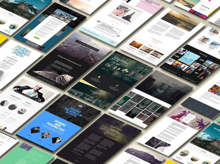
12 Rules to Follow When Designing a Website
Now let us get started with the best practices from leading design professionals. They can help you create a more engaging and attractive website to connect with your audience.
1. Responsive Design
By the end of 2019, the number of users who access the internet via mobile devices is much higher than the number of people who only surf using desktops. People use their smartphones for online purchases, study, and entertainment. Therefore, if your website doesn’t have a mobile version, it will significantly influence the quality of the user experience. If you don’t want to invest in the development of a mobile version,you need to at the very least make your design adapt to different screen sizes.
2. Simple Navigation
Grouping related items is a fundamental way to increase usability. Objects that are related or have a similar meaning should be positioned close to each other for the sake of logic. For example, buttons that mark the most common actions like “Buy”, “Put in the cart” and “Cancel” are usually located near each other. Organizing interface elements like this generates less cognitive friction. Taking a long time to search for features is often frustrating and will probably make the user leave your website.
3. Clickable Elements
When viewing lists of data, we usually want to allow the user to act with the list elements. The user can manipulate an item by clicking on it, for instance, modify, delete, or rename it. It’s very intuitive and also convenient because it permits the introduction of changes on the go and provides immediate feedback about the actions performed.
4. Consistency
The goal of every website is to make the user perform a specific target action. It might be a call, a purchase, or a download of your free guideline. Whatever it is, a design must put a clear and concise call to action on the page.
However, one CTA is not enough. The style of the website should be leading to the same goal. It includes the copy, the buttons, the links, and so on. A well-written text with working links and illustrations creates an atmosphere of trust that helps your client make the right decision.
5. Laconic Contact Forms
Humans are lazy, especially when filling in fields on a form. Each area that unnecessarily repeats increases the possibility that the user decides not to register.
Remember that not all users type at the same speed, some type slow. Filling in a form on a smartphone is even more demanding. So ask yourself if every included field is essential. Also, never forget to mark necessary steps with an asterisk to avoid unnecessary re-entries after generating an error for an area not correctly filled.
6. Display Options
In every dropdown menu you use there is a set of actions inside. If these options are necessary to obtain useful information or perform an important step, you need to make them explicit. Try using dropdown only for complicated menus or predictable choice options, such as a calendar or geographic references.
7. Visual Hierarchy of the Website
An excellent visual hierarchy separates primary elements from secondary elements. It is the result of using alignments, proximity, colors, tones, text indentation, font size, element size, padding, spacing, etc.
When a UX/UI designer respects the hierarchy and applies it correctly, the more excellent is the readability of information. The user’s attention will focus on what the designer or content manager has decided to emphasize, the time spent on the page will probably be higher, and the primary user will have captured crucial information.
8. Form Follows Function
The icons and all the other patterns the user is used to, such as sliders, pagination, mouseover effects, calls to action, arrows that warn the user there is a submenu and clear labels, facilitate the use of the site. The imperative is: do not make your user think, but facilitate all his moves.
9. Web Fonts
Reading on a monitor is more complicated than reading on paper: the text is not stable for page refreshes and is backlit. Furthermore, given the posture we assume in front of a screen, the eye needs a visual anchor to read more comfortably, which is why you should always avoid justified paragraphs.
The font you choose will be the tone of voice of the site: its choice, therefore, should not be assessed only from an aesthetic point of view, but should also be functional. Choose fonts with good readability that are specially made for the web because they will have a better randomization.
10. Carriers
Designers create vector images from lines and curves (vectors). They have the particular tendency to always be in high quality even at different resolutions without losing definition.
Designers create bitmap images from pixels placed inside a given area. When resizing a bitmap, the picture may be “grainy”, thereby losing quality. This is because the pixels that compose them are fixed on a grid of concrete dimensions. For this reason, designers should always load icons as vector files: this will allow you to have a single image that can be larger for mobile and tablets, given the retina screens, without losing definition.
11. Micro-Interaction
Micro-interactions are small, but are fundamental design details and actions that help the user experience interact with the site or with the app. The micro-interactions, if designed and used well, can:
- Increase the relationship between users and product;
- Improve the perception of a company/project;
- Create natural and immediate interactions;
- Keep the focus on empathy in design.
12. Error Handling
As already mentioned, the designer must analyze what users are used to doing and create digital products that use common patterns and ensure that the interface design has elements that are easy to access, understand and is used to facilitate user actions and minimize mistakes. Each step must be reversible and leave the user with the certainty of being able to modify and repair any errors.
All in All
Use the design to guide people within the most straightforward and most intuitive interfaces. A well-designed website is a powerful tool for businesses, and the UX/UI designer’s goal is to make it as useful as possible. Knowing these rules will significantly help you towards the success of your business.
Leave a Reply