WordPress Block Patterns for Full Site Editing (FSE) themes revolutionize website building by offering pre-designed content layouts that can be easily customized. They enable users to quickly create professional pages without coding, making website design accessible to everyone. With FSE, block patterns integrate seamlessly, giving unmatched flexibility and creative control.
What Are WordPress Block Patterns?
Block Patterns are pre-arranged collections of WordPress blocks that form ready-to-use layouts. They can include headers, galleries, testimonials, or call-to-action sections. Designed to save time, they allow you to insert complex designs instantly, then customize them to match your branding, ensuring a polished and cohesive look for your website.
Why They’re Essential for FSE Themes
In FSE Themes, block patterns speed up the design process by replacing repetitive manual formatting with reusable layouts. They ensure consistency across your site while maintaining creative flexibility. By using them, both beginners and professionals can create visually appealing pages faster, leading to more productive and satisfying design workflows.
Benefits of Using Block Patterns
Block Patterns save time by offering ready-made designs, reducing the need for custom coding. They ensure visual harmony across a website and simplify updates. Since they are reusable, users can maintain design consistency effortlessly. Additionally, they enhance creativity by providing a foundation that can be customized further.
Key Features of WordPress Block Patterns:
When working with FSE themes, block patterns offer:
- Pre-built layouts for quick page creation
- Full customization to match your branding
- Responsive design for all devices
- Easy insertion with a single click
- Time-saving structure for efficient workflows
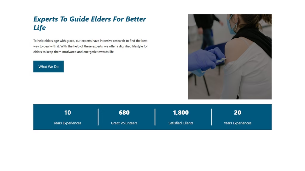
CountUp Counters Pattern
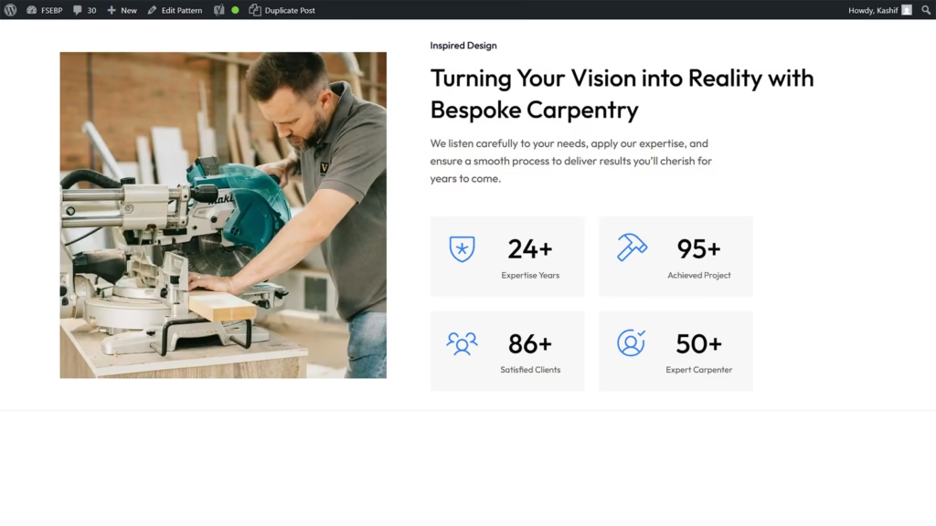
Showcase your achievements in style with the dynamic CountUp Counters Pattern, designed to capture attention and build trust instantly. This engaging feature animates numbers as users scroll, turning simple statistics into powerful visual highlights that reflect your brand’s growth and success.
By displaying key milestones, such as completed projects, satisfied clients, or years of experience, the CountUp Counters Pattern reinforces your professionalism and credibility. Its smooth, eye-catching animation draws visitors in, encouraging them to explore your site further.
Perfect for portfolios, corporate websites, and service-based businesses, this pattern blends functionality with aesthetics. It not only enhances the visual appeal of your website but also communicates your accomplishments effectively, helping to establish authority and strengthen audience confidence.
Image Compare Block
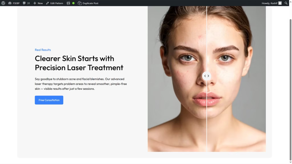
Display authentic transformation stories with the Image Compare Block in WordPress, an ideal feature for beauty, skincare, and wellness websites. This interactive tool lets visitors slide between before-and-after images, showcasing real treatment results in a visually engaging way.
By presenting clear, side-by-side comparisons, you can build trust and credibility with your audience. Whether it’s facial treatments, skin rejuvenation, or cosmetic procedures, the Image Compare Block makes it easy to highlight the effectiveness of your services.
Its responsive design ensures a flawless experience on any device, keeping your portfolio professional and impactful. Perfect for salons, clinics, and beauty experts, this feature turns your results into compelling visual proof that inspires confidence and drives client engagement.
Modern Header
A Modern Header sets the tone for your entire website, combining sleek design with functional elements to create a lasting first impression. Its clean layout, bold typography, and strategic use of space instantly capture attention while guiding visitors toward key content.
Designed for usability, a modern header often includes intuitive navigation, a prominent logo, and quick access to essential links or calls-to-action. This ensures users can easily explore your site while enjoying a visually appealing experience.
Perfect for businesses, portfolios, and blogs, a modern header adapts seamlessly to all devices, maintaining style and performance. By blending aesthetics with practicality, it enhances your brand identity, improves user engagement, and creates a professional look that keeps visitors interested from the very first glance.
Service Box
A Service Box is a stylish and effective way to present your offerings, combining clear information with eye-catching design. It neatly organizes services into visually distinct sections, making it easy for visitors to understand what you provide at a glance.
Each service box can feature an icon, title, and brief description, helping to communicate value quickly and effectively. This layout not only improves readability but also enhances the overall user experience by guiding attention where it matters most.
Perfect for business, portfolio, or agency websites, service boxes are fully responsive and adaptable to any design style. They create a professional, structured look that builds trust, encourages exploration, and ensures your services are showcased in an engaging and memorable way.
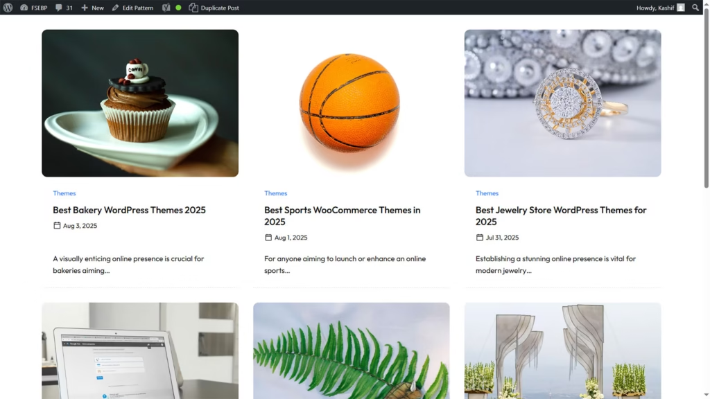
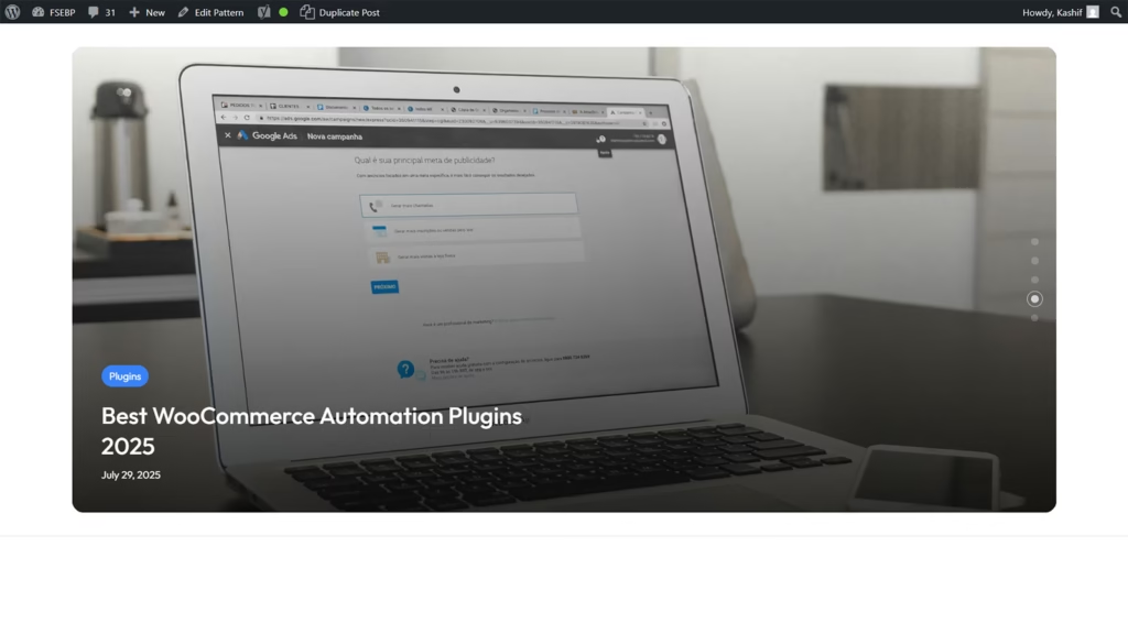
Featured Posts Pattern Cover Block
The Featured Posts Pattern Cover Block is a powerful way to highlight your most important or popular content. With its bold, visually appealing layout, it draws attention to selected articles, ensuring they stand out and attract clicks.
By combining engaging imagery with compelling headlines, this block creates a magazine-like feel that enhances your site’s aesthetics. It’s perfect for showcasing trending topics, must-read guides, or seasonal features, helping you keep visitors engaged and informed.
Fully responsive and customizable, the Featured Posts Pattern Cover Block adapts seamlessly to your branding and layout. Ideal for blogs, news sites, and content-rich platforms, it transforms your homepage or landing page into a dynamic, content-focused space that encourages readers to explore more of what you offer.
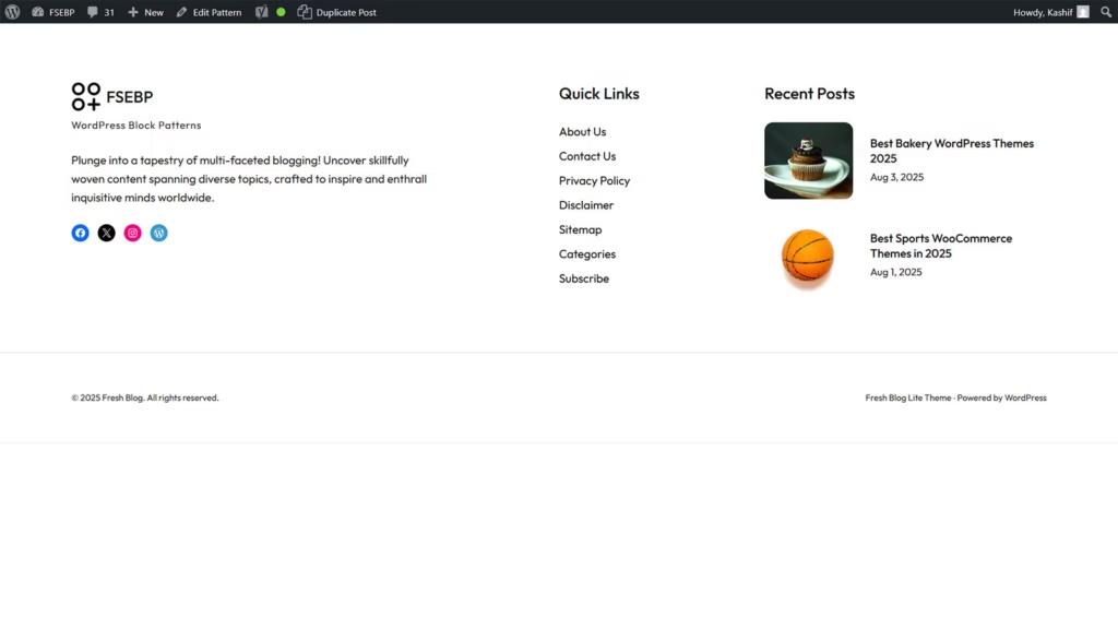
Box Footer Pattern Blogging Themes
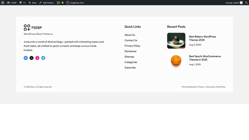
The Box Footer Pattern in blogging themes offers a clean, structured way to present essential information at the bottom of your site. Its organized design ensures visitors can easily find contact details, navigation links, or subscription options without clutter.
This footer style often includes multiple content boxes, each dedicated to a specific purpose, such as recent posts, social media links, or about information. By segmenting content, it improves readability and keeps your site looking polished and professional.
Perfect for modern blogging themes, the Box Footer Pattern is fully responsive and blends seamlessly with your website’s design. It not only enhances usability but also encourages deeper engagement, making it an effective element for boosting visitor interaction and leaving a lasting impression.
Header Pattern Right Action Button
The Header Pattern with Right Action Button is a sleek and functional design element that places your most important call-to-action front and center. Positioned prominently on the right side of the header, it captures attention immediately and encourages user interaction.
This layout is ideal for actions like “Sign Up,” “Get Started,” or “Contact Us,” ensuring visitors can take the next step without searching through menus. Combined with clear navigation and branding, it creates a balanced, user-friendly header experience.
Perfect for business, portfolio, and eCommerce websites, this pattern adapts seamlessly to all devices while maintaining a professional look. By blending visual appeal with strategic placement, the right action button helps boost conversions, guide user flow, and make your website more engaging from the very first click.
Fullwidth Blog Query Loop Pattern
The Fullwidth Blog Query Loop Pattern is a dynamic way to showcase your blog posts in an engaging, streamlined layout. Spanning the full width of the screen, it maximizes visual space, allowing your content to shine without distractions.
By automatically pulling posts based on categories, tags, or date, this pattern keeps your blog fresh and organized. Its spacious design highlights featured images, titles, and excerpts, making it easy for readers to browse and find topics that interest them.
Perfect for modern blogs, news sites, and content-rich platforms, the Fullwidth Blog Query Loop Pattern is fully responsive and customizable. It creates a visually immersive experience that encourages longer visits, improves readability, and ensures your posts remain the central focus of your site’s design.
Recent Blog Posts Pattern for Footer
The Recent Blog Posts Pattern for Footer is a smart way to keep your latest content visible across your website. Placed in the footer, it ensures visitors can discover new articles no matter which page they’re on.
This pattern typically displays post titles, thumbnails, and publication dates in a clean, compact format. By giving readers easy access to fresh content, it increases page views, boosts engagement, and encourages them to explore your blog further.
Perfect for bloggers, news sites, and content creators, the Recent Blog Posts Pattern for Footer is fully responsive and blends seamlessly with any theme. It’s a subtle yet effective way to keep your content circulating and ensure your audience always has something new to click on before leaving your site.
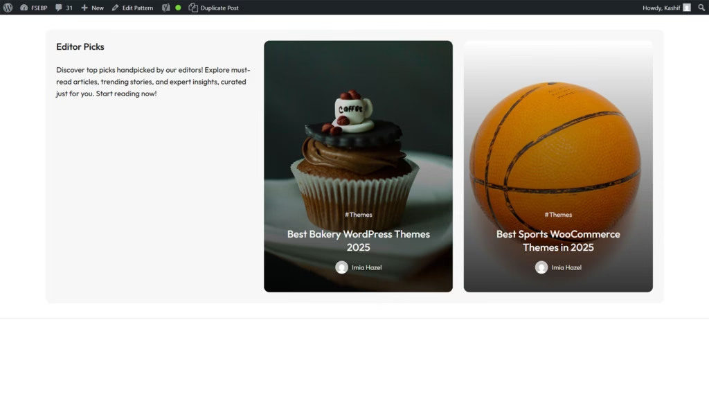
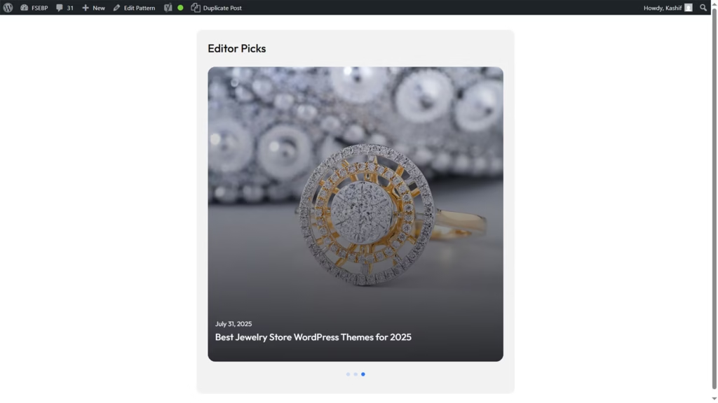
Tabbed Blog Post Pattern Trending Posts
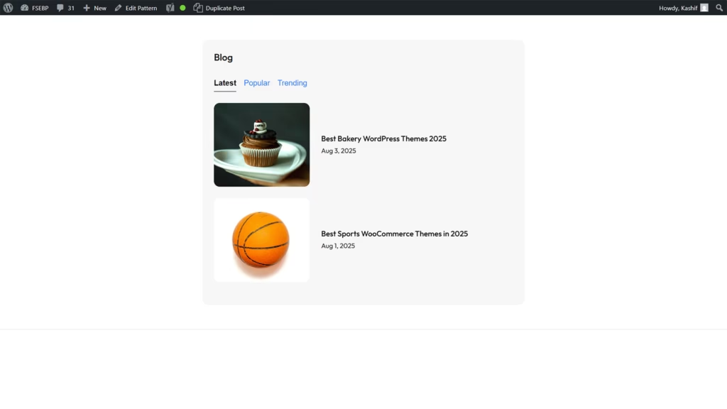
The Tabbed Blog Post Pattern for Trending Posts is an interactive and space-saving way to showcase your most popular content. Using a tabbed layout, it allows visitors to switch between categories or timeframes, such as “Most Viewed” or “Editor’s Picks,” without leaving the page.
This design keeps your blog organized while highlighting posts that deserve the most attention. With engaging thumbnails, clear titles, and smooth transitions, it enhances user experience and encourages readers to explore more of your trending content.
Ideal for blogs, magazines, and news websites, the Tabbed Blog Post Pattern is fully responsive and customizable to match your brand style. It not only improves navigation but also increases content visibility, keeping your audience engaged and returning for the latest and most popular updates.
Sidebar Carousel Pattern Blog Posts
The Sidebar Carousel Pattern for Blog Posts is a stylish way to display content in a compact yet engaging format. Positioned in the sidebar, it uses a sliding carousel to showcase multiple posts without taking up excessive space.
Featuring post thumbnails, titles, and short excerpts, this pattern encourages visitors to browse more articles while exploring your site. Its smooth scrolling effect adds a dynamic touch, making the sidebar an interactive element rather than just a static space.
Perfect for blogs, news portals, and content-driven websites, the Sidebar Carousel Pattern is fully responsive and easy to customize. It enhances content visibility, increases click-through rates, and keeps readers engaged by offering them quick access to a variety of posts right from any page they’re on.
Blog Posts Slider Cover Block
The Blog Posts Slider Cover Block is a visually striking way to showcase your latest or featured articles. With a full-width slider format, it highlights posts using bold imagery, engaging titles, and smooth transitions that instantly capture attention.
This design allows users to scroll through multiple posts without overwhelming the page, making it perfect for drawing focus to high-value or trending content. It’s an excellent tool for guiding visitors toward stories you want to emphasize the most.
Fully responsive and customizable, the Blog Posts Slider Cover Block works beautifully for blogs, magazines, and news websites. It blends visual appeal with functionality, improving content visibility while keeping the layout clean and modern, ensuring readers stay engaged from the moment they land on your site.
Features Section
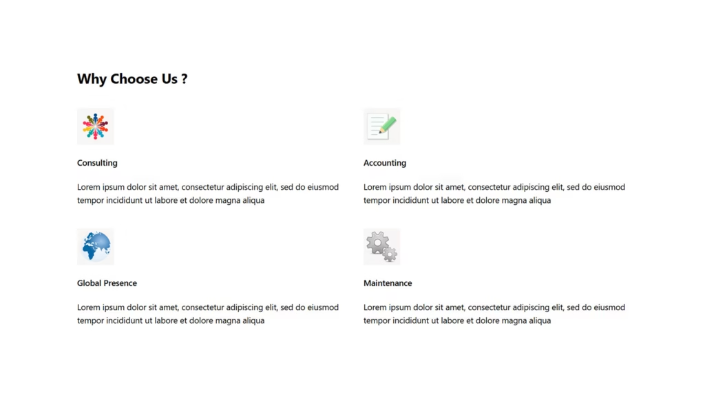
The Features Section is a key part of any website, designed to highlight the core benefits or services you offer. With a clean, organized layout, it presents information in a way that is easy to scan and visually appealing.
Each feature is typically showcased with an icon, heading, and brief description, making complex details simple to understand. This section not only informs visitors but also builds trust by clearly demonstrating the value you provide.
Perfect for business, portfolio, and product websites, the Features Section is fully responsive and customizable. It enhances user experience by guiding attention to your strengths, improving engagement, and helping potential clients or customers quickly see why they should choose you over the competition.
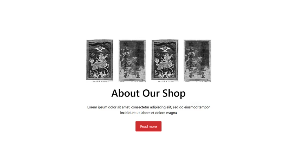
Preview Card with Buy Now Button
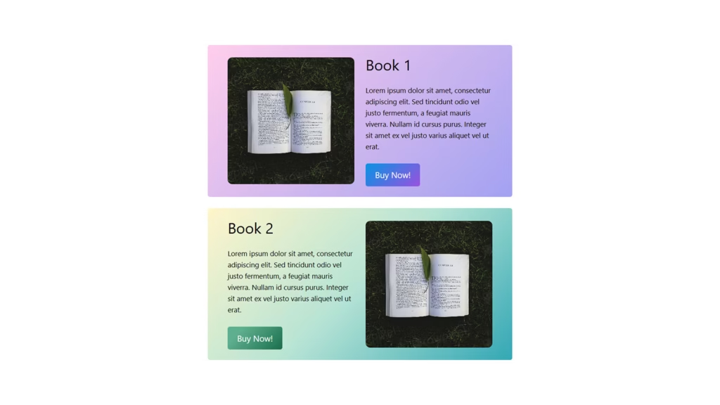
The Preview Card with Image, Description, and Buy Now Button is a powerful design element for showcasing products or services. Featuring a prominent image, it captures attention instantly and gives visitors a clear visual of what’s being offered.
Beneath the image, a concise yet compelling description highlights key features and benefits, helping customers make quick, informed decisions. This clear presentation keeps the focus on the product while providing all the essential details at a glance.
Perfect for eCommerce websites, portfolios, or promotional landing pages, the integrated Buy Now button streamlines the purchasing process. Fully responsive and customizable, this preview card boosts conversions, enhances visual appeal, and makes shopping effortless for your visitors.
Image Column with Description & Gradient
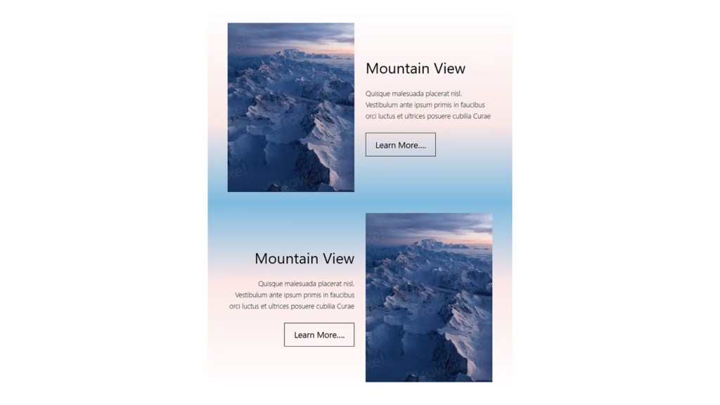
The Image in Column with Description on Gradient Background is a visually appealing layout that blends style with clarity. Featuring a striking image alongside descriptive text, it creates a balanced and engaging presentation for any type of content.
The gradient background adds depth and sophistication, making the description stand out while complementing the image. This design draws the eye naturally to both visuals and text, ensuring your message is communicated effectively without distraction.
Perfect for product showcases, service highlights, or portfolio features, this layout is fully responsive and customizable. It enhances storytelling by combining impactful imagery with clear explanations, giving your website a polished, professional, and modern look that captures attention and keeps visitors engaged.
Header Pattern Right Menu Search Overlay
The Header Pattern with Right Menu and Search Overlay offers a sleek and user-friendly navigation experience. Placing the menu on the right keeps the layout balanced and modern, while the search overlay provides a clean, distraction-free way for visitors to find content quickly.
When activated, the search overlay expands smoothly over the page, allowing users to focus solely on their query without clutter. This design improves usability and keeps the header minimal, ensuring the site looks polished and professional.
Ideal for blogs, corporate sites, and eCommerce platforms, this header pattern adapts seamlessly to all devices. By combining intuitive navigation with an elegant search feature, it enhances user engagement, streamlines browsing, and helps visitors find exactly what they need with ease.
Header Pattern Centered Site Navigation
The Header Pattern Featuring Centered Site Navigation creates a balanced and elegant look by positioning the main menu at the center of the header. This design draws visitors’ attention directly to your site’s navigation, making it easy to explore key pages effortlessly.
With the logo typically placed above or beside the navigation, the layout maintains a clean, symmetrical appearance that enhances brand visibility. This pattern works well for websites aiming for a modern yet classic feel, providing clarity without overwhelming the user.
Fully responsive and adaptable to any device, the centered navigation header improves user experience by simplifying site exploration. Ideal for portfolios, businesses, and blogs, it combines style and functionality to create a welcoming first impression that guides visitors smoothly through your content.
Header Pattern CTA Button & Site Branding
The Header Pattern with CTA Button and Site Branding combines strong visual identity with clear action prompts, creating an impactful first impression. Your logo or brand name is prominently displayed, reinforcing brand recognition from the moment visitors arrive.
Alongside branding, a strategically placed Call-to-Action (CTA) button invites users to take immediate steps like “Get Started,” “Contact Us,” or “Buy Now.” This encourages engagement and drives conversions right from the header area.
Designed for versatility and responsiveness, this header pattern works well across business websites, portfolios, and eCommerce platforms. By blending eye-catching branding with a compelling CTA, it enhances user navigation, boosts interaction, and helps guide visitors toward your key goals with ease and style.
Modern Blog Posts Pattern
The Modern Blog Posts Pattern offers a fresh and stylish way to present your articles, combining clean design with intuitive navigation. Its well-organized layout highlights featured images, titles, and excerpts, making content easy to browse and visually appealing.
This pattern often incorporates grid or list formats with ample white space, helping readers focus on each post without feeling overwhelmed. Interactive elements like hover effects and read-more links enhance engagement and encourage deeper exploration.
Perfect for bloggers, magazines, and content creators, the Modern Blog Posts Pattern is fully responsive and customizable. It elevates the reading experience, supports brand identity, and ensures your blog remains attractive and accessible on all devices, keeping visitors coming back for more.
Pill Style Tag Cloud Pattern
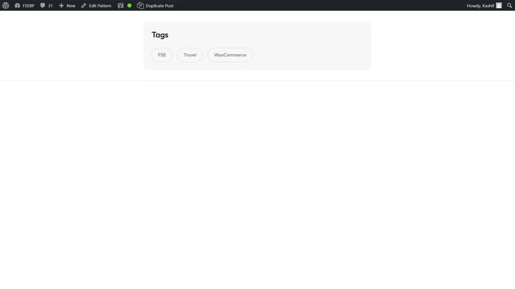
The Pill Style Tag Cloud Pattern is a visually appealing way to display keywords or topics on your website. Featuring rounded, pill-shaped tags, this design adds a modern and clean look that draws attention without overwhelming the page.
Each tag acts as a clickable link, helping visitors quickly find related content based on their interests. The varying sizes or colors of tags can emphasize popular or trending topics, making navigation intuitive and engaging.
Ideal for blogs, portfolios, and content-rich websites, the Pill Style Tag Cloud Pattern is fully responsive and customizable to match your site’s branding. It enhances user experience by simplifying content discovery and encouraging deeper exploration, all while adding a stylish and functional element to your design.
Popular Posts Pattern for Sidebar
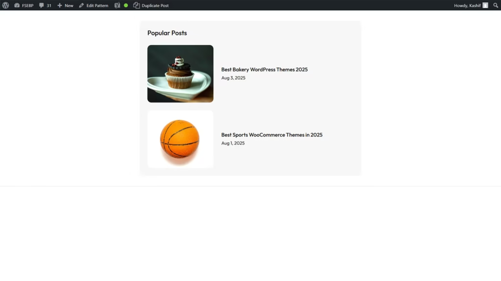
The Popular Posts Pattern for Sidebar is a strategic design element that highlights your most-read or trending articles in a compact space. Positioned in the sidebar, it ensures visitors can easily discover your best content no matter which page they’re viewing.
This pattern typically features post thumbnails, titles, and brief snippets, making it visually appealing and easy to scan. By showcasing popular posts, it boosts user engagement, encourages longer site visits, and drives more traffic to key articles.
Perfect for blogs, news sites, and content-heavy platforms, the Popular Posts Pattern is fully responsive and customizable. It enhances navigation by directing readers to valuable content, increasing overall site interaction and improving the user experience in a subtle yet effective way.
Hero Banner Rounded Image Box Style
The Hero Banner with Rounded Image in a Bento Box Style combines bold design with modern aesthetics to create a striking first impression. Featuring a rounded image alongside text blocks arranged in a clean, grid-like layout, this style balances visuals and content beautifully.
The Bento Box design organizes information into distinct sections, making it easy for visitors to absorb key messages quickly. The rounded image adds a soft, approachable feel that contrasts nicely with the sharp lines of the grid, enhancing overall visual appeal.
Ideal for portfolios, business websites, and creative agencies, this hero banner is fully responsive and customizable. It effectively captures attention, showcases your brand personality, and guides users toward important calls to action, ensuring your homepage looks fresh, professional, and engaging.
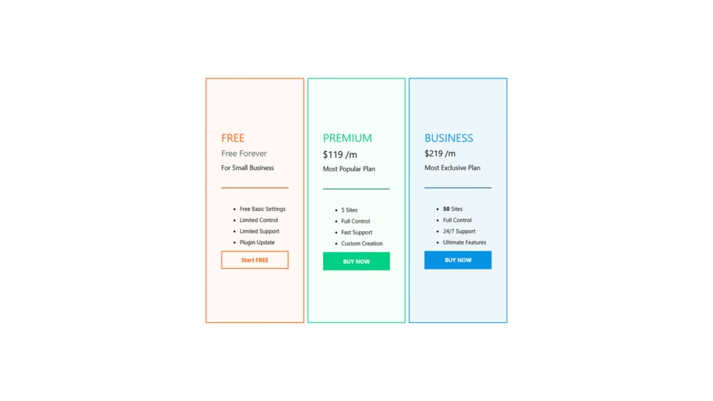
Pricing Table
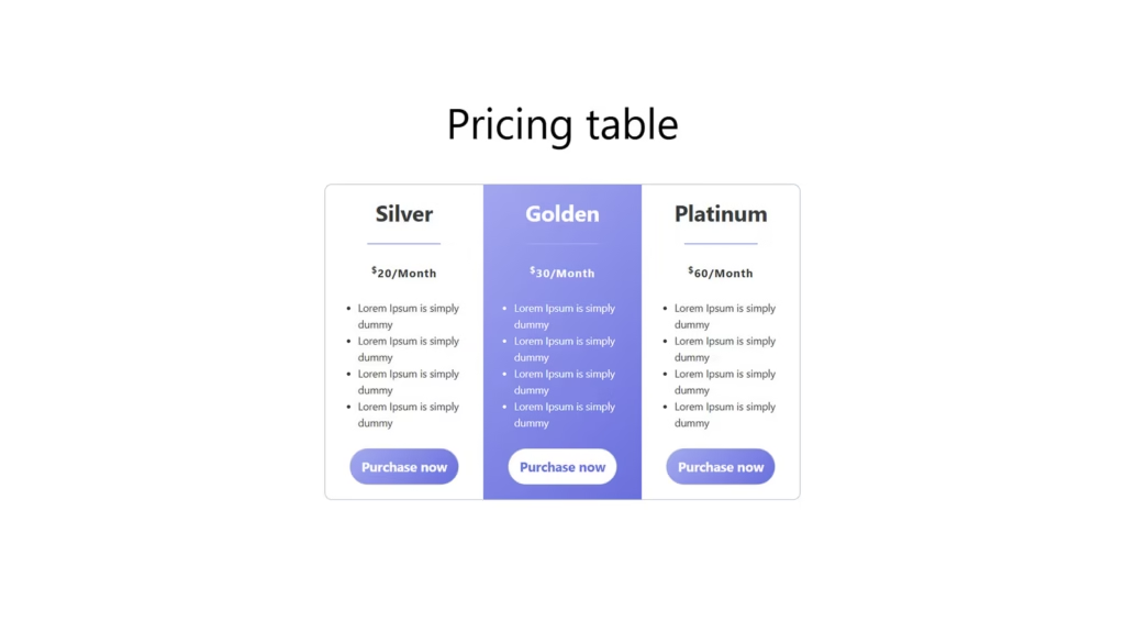
The Pricing Table is an essential element for clearly presenting your products or service plans. Organized into neat columns and rows, it allows visitors to easily compare features, benefits, and costs side by side.
Each pricing option typically includes a plan name, price, key features, and a call-to-action button, making decision-making straightforward for potential customers. This clarity reduces confusion and helps guide users toward the best choice for their needs.
Perfect for SaaS, agencies, and eCommerce sites, pricing tables are fully customizable and responsive. They enhance user experience by providing transparent information in an attractive format, boosting conversions and building trust through clear communication of value.
Footer section with flying colors
The Footer Section with Flying Colors brings a vibrant and energetic finish to your website, making the bottom of the page as engaging as the top. Using bold colors and dynamic design elements, it captures attention while providing important information and navigation options.
This colorful footer often includes contact details, social media links, quick navigation, and subscription forms, all presented in an eye-catching layout. The lively design helps reinforce your brand personality and leaves a memorable impression on visitors.
Ideal for creative agencies, blogs, and modern businesses, the Footer Section with Flying Colors is fully responsive and customizable. It not only enhances aesthetics but also improves usability by encouraging deeper site exploration and fostering stronger connections with your audience.
Full Width Call to Action Content Grid
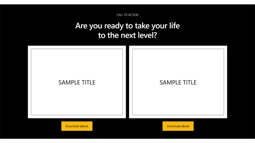
The Full-Width Call to Action Content Grid is a powerful way to promote your ebook downloads with maximum impact. Spanning the entire width of the page, it creates a bold, immersive section that immediately grabs visitors’ attention.
Organized in a clean grid layout, this section can feature multiple ebooks or offers, each with eye-catching visuals, brief descriptions, and clear download buttons. This makes it easy for users to explore and select the resources that interest them most.
Perfect for authors, educators, and marketers, the full-width content grid is fully responsive and customizable. It effectively boosts engagement and conversion rates by presenting your ebooks in a visually appealing, user-friendly format that encourages downloads and drives valuable leads.
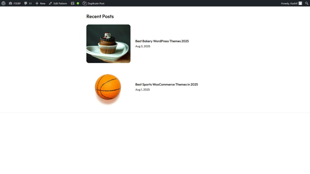
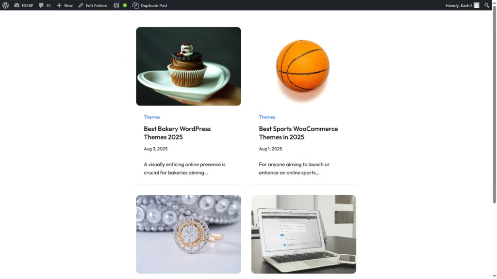
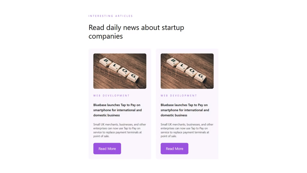
Recent Posts Pattern
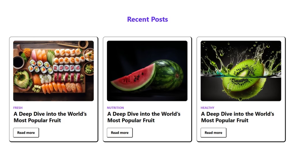
The Recent Posts Pattern is an essential feature for keeping your website content fresh and engaging. It showcases your latest blog articles or updates in a clean, organized layout, making it easy for visitors to discover new material.
Typically, this pattern highlights post titles, publication dates, and featured images or excerpts, providing a quick preview that encourages readers to click through and explore further. It helps maintain visitor interest by consistently presenting fresh content.
Ideal for blogs, news sites, and content-rich platforms, the Recent Posts Pattern is fully responsive and customizable. By keeping your audience informed and engaged, it boosts site traffic, encourages longer visits, and enhances overall user experience through seamless content discovery.
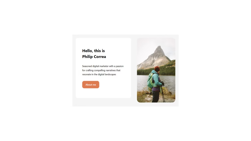
About Pattern Profile Socials
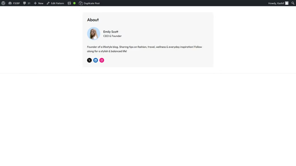
The About Pattern Featuring Profile and Socials is a stylish way to introduce yourself or your team while connecting with your audience. It combines a clear profile section with social media links, making it easy for visitors to learn who you are and follow your updates.
This pattern typically includes a professional photo, a brief bio, and clickable icons linking to your social profiles. It creates a personal touch that builds trust and encourages engagement beyond your website.
Perfect for personal blogs, portfolios, and business sites, the About Pattern with Profile and Socials is fully responsive and customizable. It strengthens your online presence by showcasing your identity and fostering community, helping you build meaningful connections with your visitors.
Three Column Footer Pattern for Blogs
The Three-Column Footer Pattern for Blogs offers a well-organized way to present important information at the bottom of your site. Dividing the footer into three distinct sections allows you to showcase categories like recent posts, contact details, and social media links clearly and efficiently.
This layout improves site navigation by giving visitors quick access to essential resources without clutter. Each column can be customized to feature widgets, menus, or calls to action, enhancing both functionality and design.
Ideal for bloggers and content creators, the three-column footer is fully responsive and blends seamlessly with any theme. It helps keep your site professional and user-friendly, encouraging visitors to stay longer and explore more by providing useful links and information in an attractive format.
Post List Widget Pattern for Sidebars

The Customizable Post List Widget Pattern for Sidebars is a versatile tool for showcasing your content in a compact, user-friendly format. Positioned in the sidebar, this widget lets you highlight selected posts based on categories, tags, or recent activity, making navigation easier for visitors.
With customization options for layout, thumbnail size, and display order, you can tailor the widget to match your site’s design and priorities. This flexibility ensures that the most relevant or engaging posts get maximum visibility.
Perfect for blogs, news sites, and content-heavy platforms, the customizable post list widget enhances user experience by providing quick access to valuable content. Fully responsive and easy to configure, it helps keep readers engaged and encourages deeper exploration of your website.
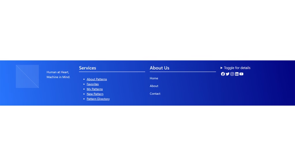
Basic Footer Pattern
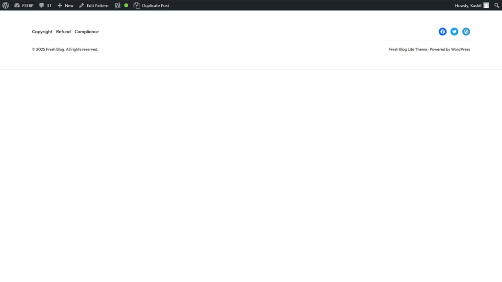
The Basic Footer Pattern provides a clean and simple way to conclude your website pages with essential information. It typically includes contact details, copyright notices, and minimal navigation links, ensuring visitors find what they need without distraction.
This straightforward design keeps the footer uncluttered, enhancing readability and maintaining a professional look. It’s ideal for websites that value simplicity and functionality, delivering important content without overwhelming the user.
Perfect for blogs, portfolios, and small business sites, the Basic Footer Pattern is fully responsive and easy to customize. It offers a reliable, user-friendly way to wrap up your pages while supporting navigation and brand consistency across your website.
Articles Posts News Blogs
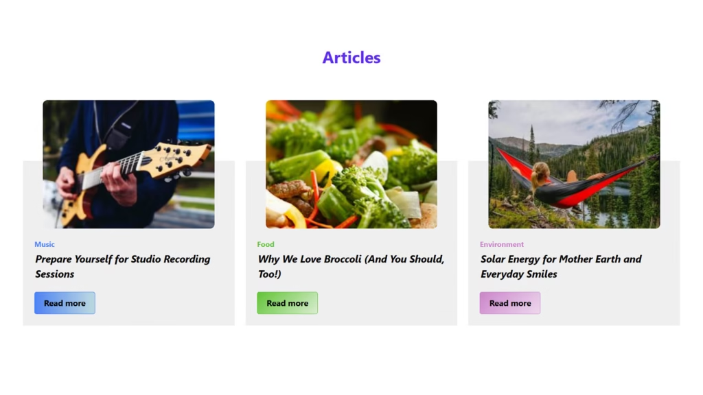
Articles, posts, news, and blogs are key content types that keep websites fresh and engaging. Articles typically offer in-depth, well-researched information on specific topics, providing value and expertise to readers.
Posts and blogs tend to be more informal and timely, allowing for regular updates, personal insights, or storytelling. They encourage interaction and community-building through comments and shares. News content focuses on delivering current events and timely updates, keeping your audience informed and connected.
Together, these content forms enrich websites by offering diverse information and perspectives. They drive traffic, improve SEO, and foster engagement, making your site a go-to resource for visitors. Whether for education, entertainment, or updates, combining articles, posts, news, and blogs creates a vibrant, dynamic online presence.
Video Background Section

The Video Background Section adds a dynamic and immersive element to your website by featuring a full-screen or section-sized video playing seamlessly behind your content. This engaging visual approach captures visitors’ attention immediately and sets the tone for your brand or message.
Ideal for storytelling, product showcases, or creative portfolios, video backgrounds bring energy and emotion that static images can’t match. When paired with clear text and calls-to-action, they create a memorable user experience that encourages visitors to stay longer and explore more.
Fully responsive and optimized for performance, the Video Background Section works smoothly across devices without compromising loading speed. It’s a powerful design choice for businesses and creatives looking to stand out and deliver impactful content in a modern, visually striking way.
Beveled Edges with Image as Cover
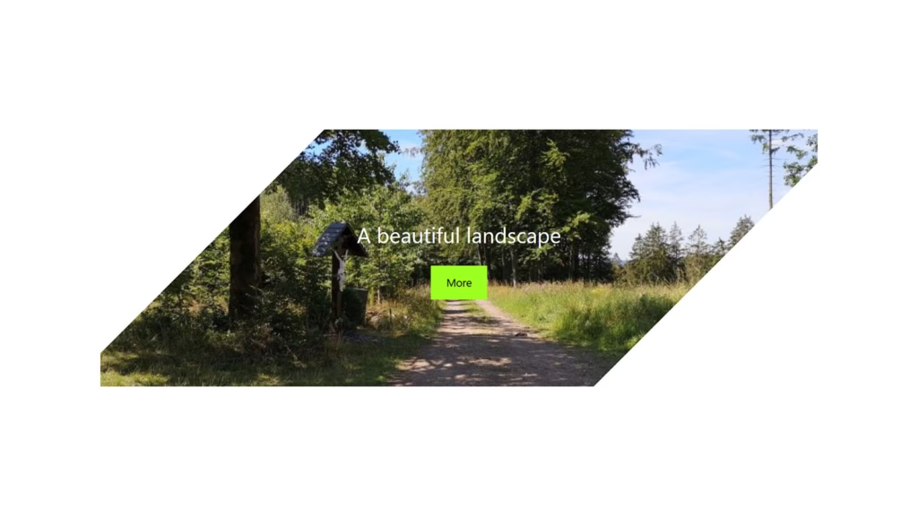
The Beveled Edges with Image as Cover design adds a unique, stylish touch to your website by framing images with angled or slanted edges. This subtle yet striking effect creates depth and visual interest, making your visuals stand out from traditional rectangular shapes.
Using an image as a cover within beveled edges enhances the overall aesthetic by combining modern design trends with strong imagery. It draws the visitor’s eye and adds a sense of sophistication to portfolios, galleries, and product showcases.
Fully customizable and responsive, this pattern works well across all devices, maintaining its sharp look without distortion. Perfect for creative websites, agencies, and brands aiming to impress, beveled edges with image covers elevate your site’s visual appeal while keeping the design fresh and engaging.
Blog Two Columns
The Blog Two Columns layout offers a clean and organized way to display your posts, balancing content and visuals effectively. By splitting the blog section into two columns, it maximizes space while maintaining readability, allowing visitors to browse multiple articles at once.
Each column typically features post thumbnails, titles, excerpts, and publication dates, making it easy for readers to scan and choose what interests them. This layout enhances user experience by providing a structured yet engaging way to explore your content.
Ideal for personal blogs, magazines, and news websites, the two-column blog design is fully responsive and adaptable to any screen size. It helps keep your site looking fresh and professional while encouraging visitors to spend more time discovering your latest posts.
Banner Title with Images & Bitton
The Banner Title with Images and Button is a compelling design element that combines eye-catching visuals with clear calls to action. Featuring a bold title alongside striking images, it immediately captures visitors’ attention and communicates your key message effectively.
Incorporating a button within the banner encourages user interaction, guiding visitors toward desired actions such as “Learn More,” “Shop Now,” or “Subscribe.” This combination of visuals and prompts enhances engagement and boosts conversion rates.
Perfect for landing pages, promotional sections, and homepage highlights, the banner with title, images, and button is fully responsive and customizable. It creates a visually appealing and functional focal point that draws users in and drives them to explore your site further.
Minimal Posts Cover Pattern
The Minimal Posts Cover Pattern offers a clean, elegant way to showcase your blog or article covers with simplicity and style. This design emphasizes whitespace and subtle typography, allowing your content to speak without distractions.
By focusing on essential elements like featured images, titles, and brief excerpts, the pattern creates a calm and organized browsing experience. It’s perfect for readers who appreciate clarity and ease of navigation when exploring your posts.
Ideal for personal blogs, portfolios, and magazines, the Minimal Posts Cover Pattern is fully responsive and adaptable to different devices. It enhances your website’s professionalism and readability, making your content inviting while maintaining a modern, understated aesthetic.
Header Pattern Search Overlay Button
The Header Pattern with Search Overlay Button offers a sleek and user-friendly way to enhance site navigation. Featuring a minimalist search icon in the header, it keeps the design clean while providing quick access to powerful search functionality.
When clicked, the search overlay smoothly expands over the page, allowing users to focus solely on their queries without distractions. This seamless interaction improves usability and helps visitors find content quickly and efficiently.
Ideal for blogs, eCommerce sites, and corporate websites, this header pattern is fully responsive and easily customizable. By combining simplicity with functionality, the Search Overlay Button enhances the user experience, making your site more intuitive and engaging from the very first visit.
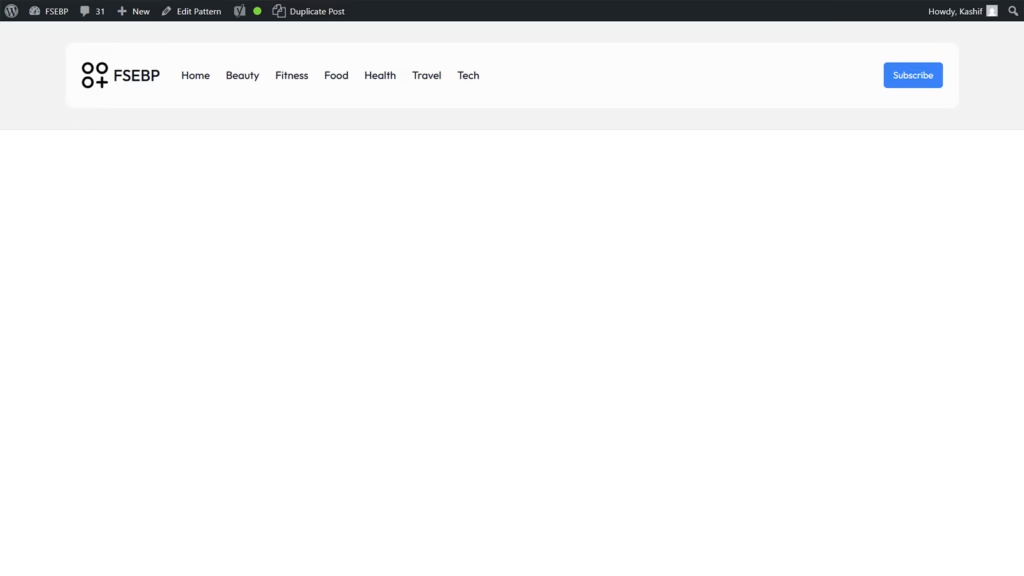
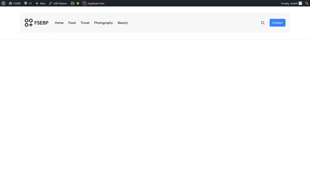
Basic Header Pattern
The Basic Header Pattern provides a simple and clean way to introduce your website’s navigation and branding. With a straightforward layout, it typically includes a logo on the left, a clear menu, and minimal distractions, making it easy for visitors to find their way around.
This pattern focuses on usability and clarity, ensuring that key elements like site identity and navigation links are immediately accessible. Its minimalist design works well for a wide range of websites, from blogs to corporate sites, where functionality is a priority.
Fully responsive and customizable, the Basic Header Pattern adapts smoothly to all devices and screen sizes. It creates a professional and user-friendly experience that helps visitors navigate your site effortlessly while keeping the design clean and timeless.
Plugin Pricing Table
The Plugin Pricing Table is a handy tool designed to clearly display different subscription plans or product tiers within your website. It organizes pricing options side by side, allowing visitors to easily compare features, costs, and benefits.
Each column typically includes plan names, prices, key features, and a call-to-action button, helping users make informed decisions quickly. This clarity reduces confusion and boosts conversions by guiding visitors toward the best option for their needs.
Ideal for SaaS businesses, digital products, and service providers, the Plugin Pricing Table is fully customizable and responsive. It seamlessly integrates into your site’s design, enhancing user experience while presenting pricing information in an attractive, straightforward format that builds trust and encourages sign-ups.
Hero Section
The Plugin Pricing Table is a handy tool designed to clearly display different subscription plans or product tiers within your website. It organizes pricing options side by side, allowing visitors to easily compare features, costs, and benefits.
Each column typically includes plan names, prices, key features, and a call-to-action button, helping users make informed decisions quickly. This clarity reduces confusion and boosts conversions by guiding visitors toward the best option for their needs.
Ideal for SaaS businesses, digital products, and service providers, the Plugin Pricing Table is fully customizable and responsive. It seamlessly integrates into your site’s design, enhancing user experience while presenting pricing information in an attractive, straightforward format that builds trust and encourages sign-ups.
Conclusion
In conclusion, WordPress Block Patterns for FSE themes make website creation faster, more flexible, and visually consistent. By combining pre-designed layouts with full customization, they empower users to build professional websites effortlessly. Whether you’re a beginner or a seasoned designer, block patterns are an essential tool for creating standout WordPress sites.
Leave a Reply