It is no discovery that creative logo design ideas of the year are always based on past trends. Although current trends change almost every year companies update their personal logo design much less often. However, it’s important not to maintain a bad logo design. The world of graphics is determined by the trends that manage to keep afloat for several years.
In 2019, the following trends will dominate design:
1. Bright colors
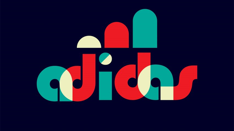
First trend is the use of saturated colors. This old school vibe will leave its mark on the brands that will be created in 2019.
In the new year, combinations of juicy shades will be especially relevant. Take a look at the vintage logo design of Adidas. Although most companies prefer two-dimensional images, bright 3D logos promise to be a real hit in 2019.
2. Gradients
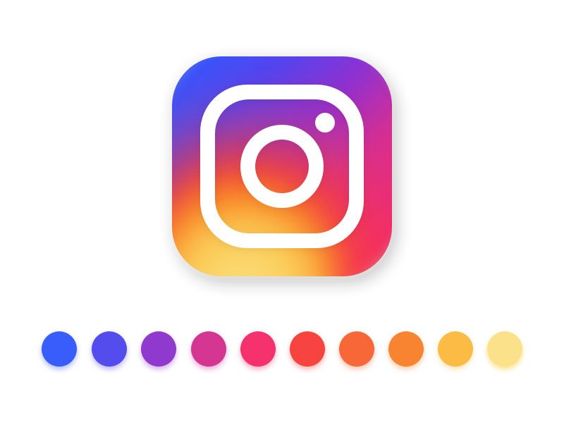
Remember how two years ago, Instagram updated its app the users were disappointed: “Seriously? Normal gradient? “. As it turned out, the social network became a real trendsetter. After its bold step, the companies one by one adopted gradients. Singh N. recommends to choose colors according to the colors table. Now everyone is crazy about gradients. Gradients have dominated the world of graphic design for several years.
3. Metallic Scripts
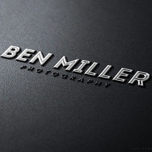
Although you can’t surprise anyone with metallic logos,this year will be their finest hour. The times when metallics were used only in jewelry brands are long gone.
Although the metallic effect is subconsciously associated with luxury and exclusivity, it has a fairly widespread use. Metallic radiance, a can drastically transform even the most ordinary emblem.
4. Minimalism
The secret to the success of a minimalist logo is that it looks completely normal, but it is remembered for a long time. Many companies prefer such emblems, because they look good in any size. The first minimalist movement was in 1970s, and appeared again only some years ago. The combination of minimalism and geometric elements allows artists to create simple, elegant and meaningful elements.
5. Minimalistic text
In 2019, get ready to watch all sorts of minimalistic combinations: with geometric shapes, with illustrations, black and white, color. The minimalist style finds a vivid expression in the graphic text. The basis of such emblems is one or several letters from the brand name. Often the full brand name is added on business cards, brochures, billboards.
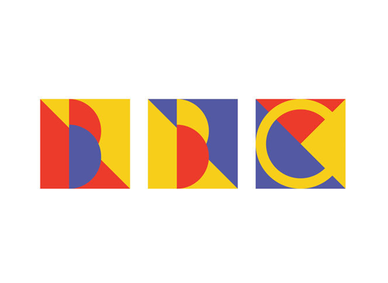
The logo of the BBC channel from the user under the name Juleha.
6. Artistic Creations
The dream of any designer is to get an order for a logo that would allow them to fully unleash their creative potential. First, your emblem must be readable in any size. Secondly, the choice of color has a huge impact on the feelings and sensations that your brand causes. Obviously, you need to listen to the wishes of the customer company.
7. Illustrations replacing letters
You must have seen visuals where a picture replaces part of a word (one or two letters). Such an illustration not only symbolizes the missing letter, but also carries a message about a brand or product.
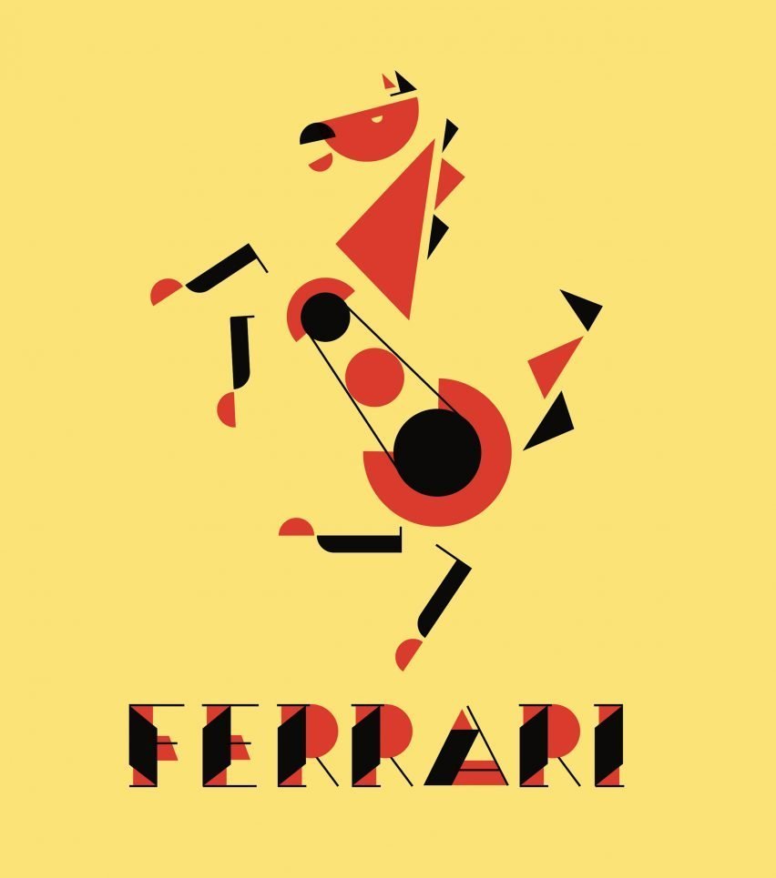
8. Original Images
Of course, the year 2019 cannot be imagined without brands, which embodied the most daring and creative ideas! Claudia C. states that geometry in brand visualization look like clean and minimal. Usually this is the full name of the brand, decorated in a unique and unmistakably recognizable style.
9. Geometric shapes
In 2019, get ready to watch all sorts of minimalistic combinations: with geometric shapes, with illustrations, black and white, color. The minimalist style finds a vivid expression in the graphic text. The basis of such emblems is one or several letters from the brand name. Often the full brand name is added on business cards, brochures, billboards. Why text should be minimalistic? Due to the fact that it carries a main message, main idea or the fundamental thought. Can it be as long as an argumentative essay outline? By no means!
We firmly believe that geometric shapes and brands are a match made in heaven. For example, a circle means constancy and fullness, and a square gives a sense of stability.
Geometric shapes have one valuable property: they present a complex image in a simple and understandable forms.
10. Simplistic Pictures

The desire to simplify the brand image to ensure the highest possible readability, regardless of size and on different media will remain in trend this year. Proof of this can be called the fact that large companies persistently continue to get rid of insignificant details on their logo.
Bio: Mary Hampton is a professional writer with a primary interest in design. She cooperates with brands and writes design plans for different websites. Mrs. Mary also leads her personal social page where she writes about recent news in the field of technology and design.